The Last Official Gatsby
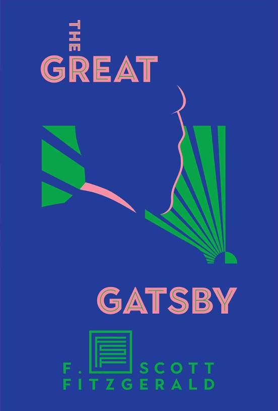
I suspect this bold cover was an attempt by Scribner, the original copyright holder of The Great Gatsby, to place an eye-catching edition on the shelves before the onslaught of competition in 2021. The vibrating green and pink and ample negative space would have helped it stand out on a crowded shelf.
Pros
The designer demonstrates an assertive commitment to asymmetry, and the intersecting “THE” is a particularly bold choice. (Though no doubt an unseen grid has determined its placement.) Also, the cover is evocative of the twenties without resorting to cliché.
Cons
It’s hard not to be distracted by the green light’s resemblance to Japan’s controversial Rising Sun Flag, and the illustration could just as easily grace the cover of Phillip K. Dick’s The Man in the High Castle.
I also don’t think the designer’s attempt to turn the author’s initials into a monogram logo is particularly successful—Roger Federer Fitzgerald is not—and again, its odd placement seems reliant upon an unseen grid.
Cover Rating
•••••