The Modernist Gatsby
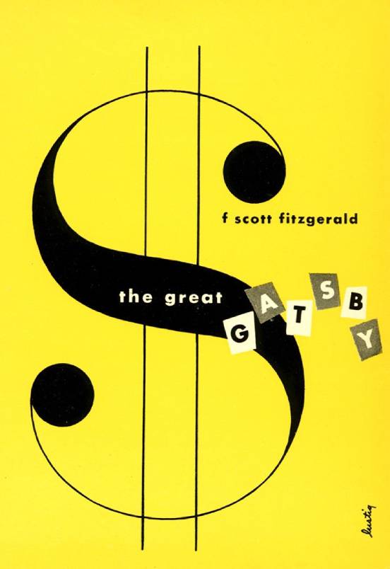
Legendary designer Alvin Lustig gets straight to the point: The Great Gatsby is about money.
Pros
It’s a gobsmackingly handsome image utilizing minimal type, color, and shape. I’d like to hang it in my office.
Cons
Far be it from me to question Alvin Lustig, but do the component parts support the novel, or do they really just support each other? I’m thinking particularly of the vaguely ransom-note-like letters. They suit the composition, but what, if anything, do they communicate about Fitzgerald’s work?
Cover Rating
•••••